How Do Star Charts Work?
Star Charts and Accuracy
How do star charts work? It is difficult to be perfect when they are attempting to solve an impossible problem: how to represent the three-dimensional night sky mapping on a flat surface. It is a question that has occupied astronomers since people first believed the Earth was round.
The perfect solution would be an Earth sphere suspended in a clear, jelly-like solid, with the stars suspended in a matrix around it. But even this would nearly fail. There would be vast areas of emptiness with small shiny dots scattered loosely around. The sheer silence of that empty space is part of what makes the night sky so difficult to render honestly.
Table of Contents
The scale of emptiness boggles the imagination. If the Sun were reduced to the size of an orange and placed on top of the Washington Monument, Proxima Centauri, our nearest stellar neighbor, would be an orange growing on a tree somewhere near Miami, Florida. Everything in between would be vacuum, an absence save for a few wandering asteroids. A star chart compresses that immense distance into inches, which is part of why any rendering must fail at approximating true scale.
And distance is not uniform, which compounds the problem. The stars on a chart look as though they sit at a common depth, but they do not. Proxima Centauri is about four light-years away. Deneb, a star most people in the Northern Hemisphere have looked at without a second thought, is roughly two thousand six hundred light-years away, something like six hundred times farther. The chart places them side by side as equals. The truth is that the light from one of them left during the last few years, and the light from the other left around the time the Roman Republic was getting started.
But scale is only the first impossibility. Even a perfectly scaled sphere faces a second problem, one that has nothing to do with distance: a curved surface cannot be flattened onto a page without distorting something. This is the problem astronomers share with mapmakers.
The Cartographer’s Problem

Astronomers face the same problem mapmakers face when flattening a sphere onto a flat page. It does not work. Different mapmakers suggest different solutions, Mercator, Robinson, and Peters projections are all different approaches to solve the same problem. Curves and bumps cannot lie flat without distorting. According to Gauss’s Theorema Egregium, the Gaussian curvature of a sphere is nonzero, and any flat image of it must distort something. To even approximate shape, mapmakers must prioritize: preserving angles, preserving areas, or preserving straight-line paths.
Astronomers carry an additional complication cartographers do not: the night sky looks different depending on where you are standing on Earth.
This is not a minor difference. Someone standing in Antarctica is looking in a completely different direction than someone in the Arctic looking up. Polaris sits almost directly above Earth’s North Pole, so from the Northern Hemisphere it appears fixed while everything else rotates around it. From Australia, Polaris never rises above the horizon at all. The Southern Cross cannot be seen from most of North America. A star chart made for a birth in Reykjavik and one made for a birth in Buenos Aires on the same night, at the same hour, will look like two different skies, because they are.
The Celestial Sphere
To address this, scientists use a model called the celestial sphere. This is where the Earth sits at the center of an enormous imaginary ball. The Sun and planets are close in and a scattering of nearby stars surrounds them and deep-space objects lie beyond. It is a framework that lets us organize something too vast to hold any other way. An armillary sphere is one way that human have envisioned the sphere for over 2200 years.

For charting purposes, we treat all stars as if they sit on the inside of the sphere at equal distance, regardless of how far away they are. Like they were painted inside a ball. This holds up because stellar parallax, the apparent shift of nearby stars as Earth orbits the Sun, is so small that the sphere functions as a workable approximation for naked-eye observation.
To navigate this sphere, we use an equatorial coordinate system with two values:
- Right ascension, the longitude analog
- Declination, the latitude analog
This physical location, plus the time, determines which stars the observer sees: someone in New York at midnight will see different stars than someone in Australia at midnight.
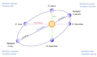
The celestial equator is a projection of Earth’s equator onto the sphere. The ecliptic is the apparent path of the Sun across the sphere over the course of a year, and it runs tilted at about 23.5 degrees relative to the celestial equator. These circles serve as anchors for everything else.
Why the Sky Changes
A chart is not only fixed to a place. It is fixed to a moment, and the sky moves through several rhythms at once.
The fastest is rotation. The Earth turns once on its axis, and the whole sphere of stars appears to wheel overhead in response.
Thus the sidereal day, about 23 hours and 56 minutes, which is roughly four minutes shorter than the 24-hour solar day we set our clocks by. This gap is there because the Earth is also moving along its orbit, so it has to turn a little extra each day to bring the Sun back to the same place. The stars do not need that extra turn.
The practical effect is that the sky shifts about one degree every four minutes, and any given star rises about four minutes earlier each night. Over weeks those minutes accumulate into the difference between an evening sky and a pre-dawn one.
Slower than rotation is the orbit. As the Earth travels around the Sun, across a year, the night side of the planet faces a steadily changing part of deep space. The constellations overhead at midnight in summer are not the ones overhead at midnight in winter; they sit on the far side of our orbit, lost in the Sun’s glare for half the year and returning to the night sky six months later. This is why Orion is a winter companion in the Northern Hemisphere and simply absent in July. The stars have not moved. We have.
A star chart has to commit to one instant inside all of this motion. It freezes a single frame: this place, this date, this hour, this minute. Change any one of them and the sky on the page is no longer the sky that was overhead.
Choosing a Projection
Even with a coordinate system in place, there is no perfect solution to our mapping problem. Each projection is a choice about what features to protect and what need to be sacrificed.
Equal-area projections preserve the relative sizes of regions. The trade-off they carry is shape distortion: Orion can look stretched or squeezed depending on where it falls on the map, even though its size relative to its neighbors is correct.
Conformal projections preserve angles and local shapes. The trade-off with this model is the area distortion: a smaller constellations near the edge can appear larger than one at the center, even if the two are the same actual size.
Equidistant projections preserve distances from a central point. A star twice as far from the pole as another will appear twice as far on the map, but shapes and sizes elsewhere will warp considerably.
Zenithal (azimuthal) projections center the map on a single point, much like someone lying on their back looking straight up: the chart is drawn from that exact vantage point, with the horizon forming the outer edge of the circle. We reference stars by their horizontal coordinate system (altitude and azimuth); it is these coordinates that tell us where each star should be.
What a Star Chart Actually Contains
A complete star chart is built from four overlapping layers.
The first layer is the stars themselves, plotted at their catalog positions for a specific reference date called an epoch. Most modern charts use J2000.0, star positions as they stood on January 1, 2000. GoRhyme charts draw from the HYG catalog, a merger of Hipparcos satellite data, the Yale Bright Star Catalog, and the Gliese catalog of nearby stars, which, while not the most complete reference available for visual-magnitude stars (Gaia now vastly exceeds it in depth and precision), is perfect for those who wish to study small-telescope or naked-eye stars.
When you look at the night sky, some stars are obviously brighter than others. We call this difference the apparent magnitude. It is a logarithmic, backwards scale where lower numbers are brighter. Sirius, the brightest star in the night sky, sits at minus 1.46, which is why it carries a negative number. Our naked eye can see down to about plus 6, though those stars appear very dim.

The stars also appear to be different colors: some a cool blue, some white, some red. The apparent color is due to blackbody radiation; stars glow because they are extremely hot, and the color tracks how hot. The spectral sequence OBAFGKM runs from hottest to coolest, with O above 30,000 Kelvin appearing blue and M below 3,700 Kelvin appearing red.
The second layer is constellation lines and boundaries. The International Astronomical Union formalized 88 constellations in 1922 and their official borders were drawn by Eugène Delporte in 1930.
The third layer is the coordinate grid: lines of right ascension and declination that function like latitude and longitude, allowing the reader to locate any object on the chart.
The fourth layer is the solar system: the Sun, Moon, and planets. These bodies move against the stellar background from night to night and year to year, which is why a chart of the sky on April 14, 2003, looks different from one for April 14, 2024. Every day is unique.
What Makes a Chart Accurate?
Several factors determine star position accurately.
Precession: a chart built from J2000.0 positions applied to a date a century earlier or later will drift. Precession is the slow wobble of Earth’s axis that shifts the entire coordinate grid over thousands of years.

Proper motion: for nearby stars, movement against the background accumulates and lengthens. For example, Barnard’s Star moves about 10 arcseconds per year relative to background stars. Both factors mean the sky our great-great-grandparents saw is measurably different from the one we see now.
Atmospheric refraction: Light bending at the horizon makes stars appear slightly higher than their correct position. Whether to correct for this is itself a design choice, and one that separates charts built for decoration from those built for precision. A rocket guidance system needs it. Art does not.
A Chart of One Moment
So, every chart has to juggle, for our star charts a zenithal projection is the most accurate. It is meant to show a moment in time for a person looking up, in one second of time. The distortion at the edges does not matter, what matters is the picture of what was.